With Queue-it you get live analytics to understand how your waiting rooms are performing, how visitors are behaving, and how the on-the-fly adjustments you make play out in real time.
These real-time analytics can be important in confirming your technical setup is sound and in facilitating any troubleshooting you might need to perform. You can also use these analytics to make business decisions while visitors are safely queued, and your backend is protected.
Queue-it gives you access to historical data that you can use to optimize waiting rooms for future sales and understand visitor traffic origin and patterns. This data can help you understand how traffic inflow levels impact your web application so you can fine-tune performance in the future.
Queue-it offers you both real-time and historical data points to help your investigations and resolve the questions you need to be answered. Examples of data points include:
- Traffic inflow & outflow
- Traffic origin, patterns, deviations, and visitor details
- Wait time metrics
- Abuse & fraud flags
- Unusual requests analysis
- Admin platform audit trail
- Individual waiting room performance overview
In the “Data in Action” section below, you can see examples of Queue-it analytics and how you can apply the insights from waiting room data to your business objectives.
You can access this data in the GO Queue-it Platform, our web-based admin platform, or via our REST-based APIs, which accept both XML and JSON formatted data.
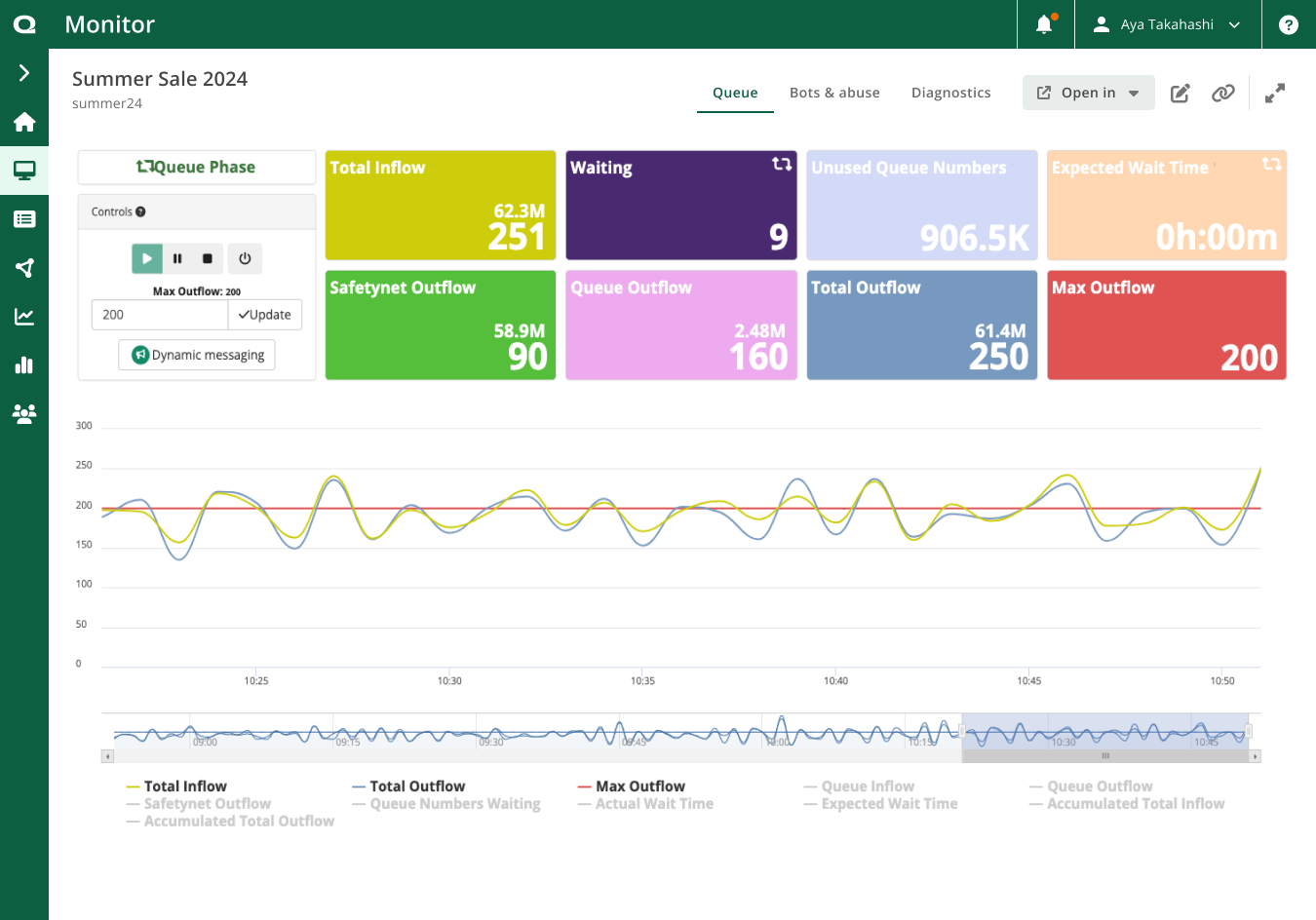
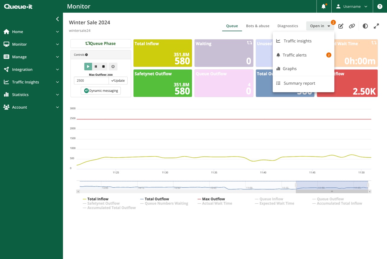
The GO Queue-it Platform Waiting Room Monitor is your go-to reporting overview for an active waiting room. Here you can quickly see the most important traffic and waiting room metrics in real time. If you wish to dive deeper, you can further investigate visitor details by clicking on the “Investigate further” button. You can securely share a view-only version of the Monitor page with stakeholders so they can follow along without needing GO Queue-it account access.
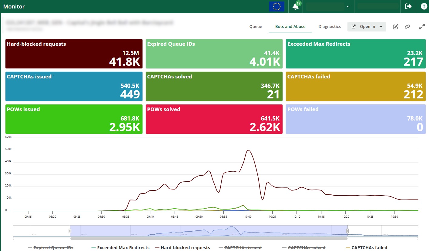
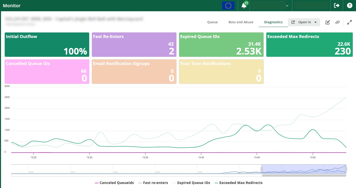
The Monitor page has three views: Queue, Bots & Abuse, and Diagnostics.
Queue view
From the Queue view, you can check:
- traffic inflow
- number of visitors in the waiting room
- unused queue numbers
- current expected wait time
- total outflow from the waiting room
- maximum outflow of visitors per minute.
You can also adjust on-the-fly how many visitors are redirected from the waiting room to your site.
Bots & abuse view
The Bots & Abuse view shows important bots and abuse metrics, both as summed totals and metrics per minute. You also get an overview of fraudulent activities, specifically the "rejected" metrics which show failed attempts to access your waiting rooms.
Diagnostics view
From the Diagnostics view, you get additional data on user behavior to help you more quickly identify and troubleshoot any issues with a running waiting room.
Key waiting room data points—like fast re-enters or canceled queue IDs—can help alert you to technical problems with the implementation of the virtual waiting room.
The summary report gives you a concise, visual overview so you can evaluate waiting room performance quickly and communicate with stakeholders in an easy-to-understand way.
Get key metrics in a clear layout for scheduled and 24/7 Peak Protection waiting rooms and explore customer journey insights for Invite-only waiting rooms. Create the summary report directly from the waiting room Monitor and share the link immediately with whoever you need to keep informed.
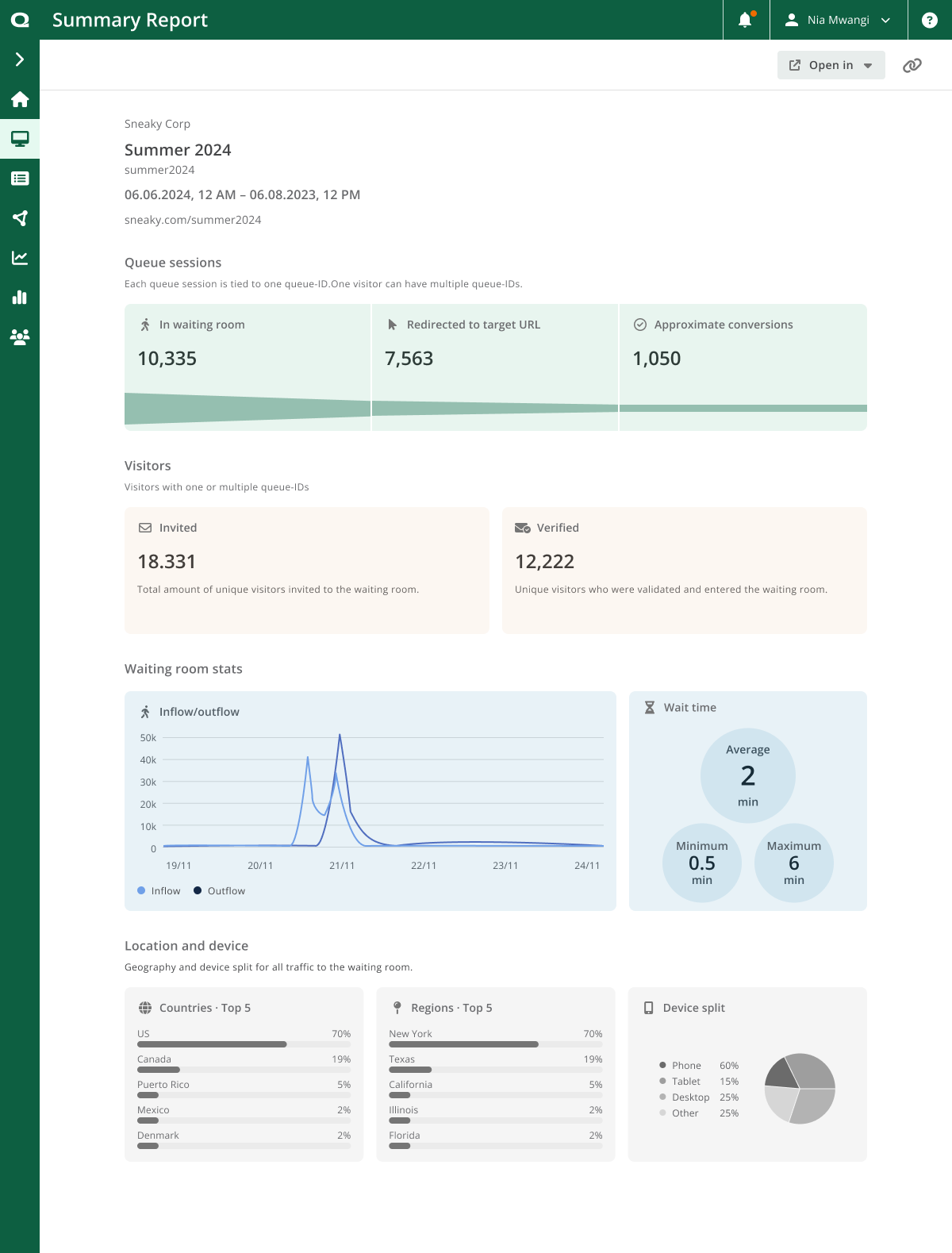
Summary report for an invite-only waiting room
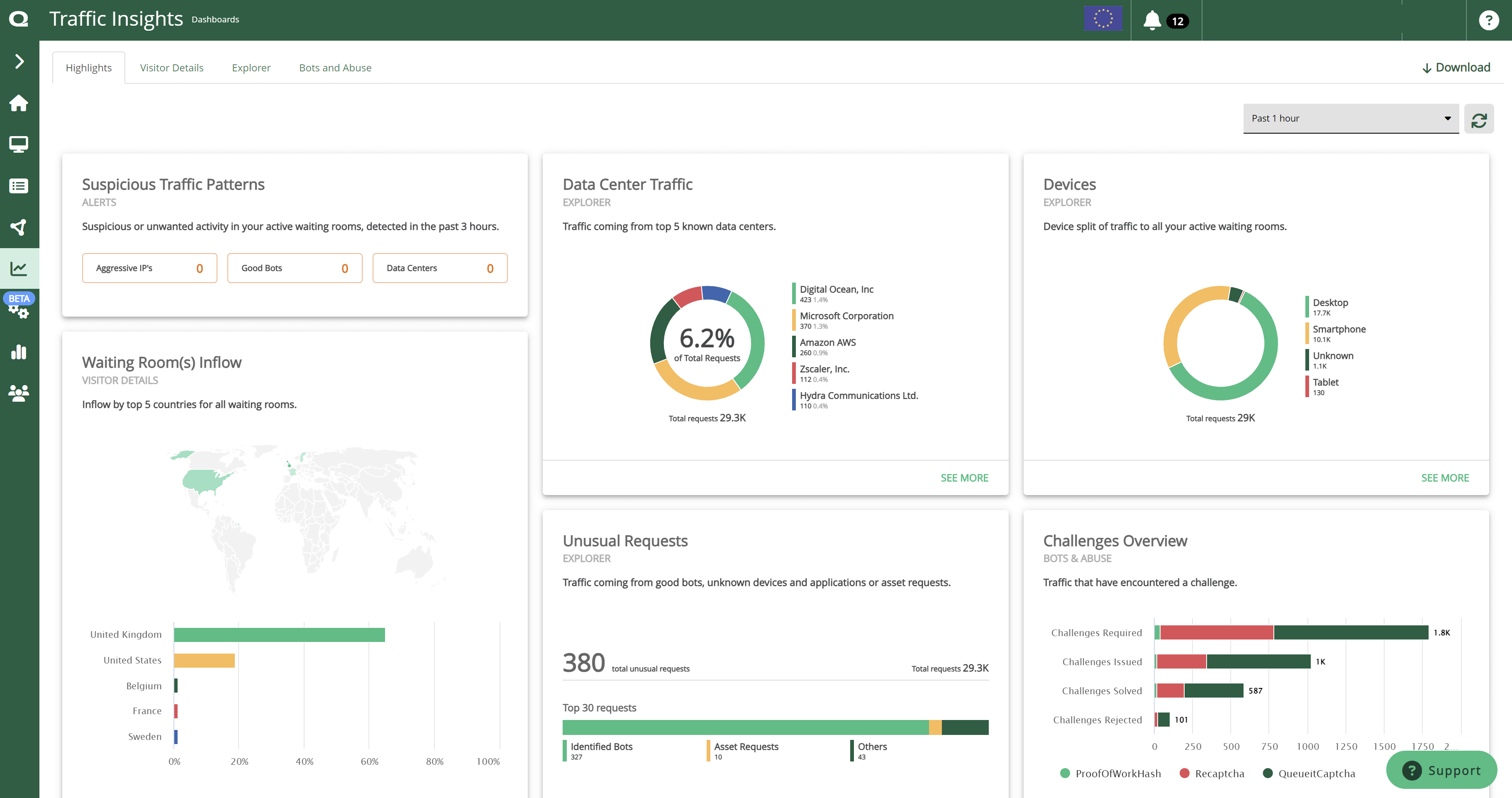
Traffic Insights is an analytics tool directly accessible via the GO Queue-it Platform menu.
It gives you a visual, actionable overview of your waiting room traffic and visitor details with accurate server-side analytics. It helps you understand your traffic to ensure you serve genuine visitors and block bad bots.
Under the Traffic Insights menu, you can find 3 dashboards (Highlights, Visitor Details, Explorer) and traffic Alerts page.
Highlights
The Highlights page is your fastest way to understand abnormal traffic patterns across all your waiting rooms. The page highlights the severity and extent of data centers, social media crawlers, and other unusual actors. You are guided to further investigate and/or act on the traffic.
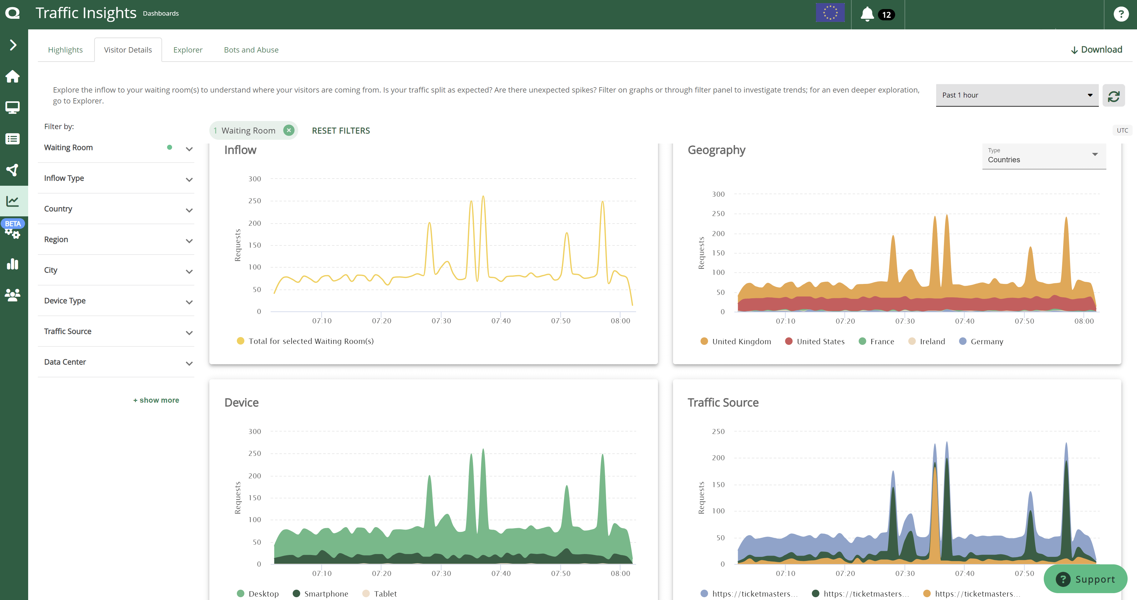
Visitor details
The Visitor Details dashboard shows the inflow to your active waiting room(s), which you can filter and visualize in time series graphs. You can use this dashboard to spot deviating traffic patterns and investigate:
- Where traffic is coming from
- Which devices are used
- Who the referrer(s) are
The dashboard provides you with key information about traffic origin and gives a quick way to spot any deviating traffic patterns. You can slice and dice the information using 8 main filters and visualize everything in time series graphs.
The 8 main filters are:
- Waiting room
- Inflow type
- Country
- Region
- City
- Device type
- Referrer
- Data center
Additional filters:
- Waiting Room(s)
- Inflow
- Queue ID
- Referrer
- Known Data Centers
- Country
- Region
- Cities
- Device
- IP Addresses
- User Agent
- Application
- Domain
- Request Type
- Action
- User ID
- Response Code
- SDK
- Target URL
- Target Domain
- ASN
- IP Class
- Crawler Name
- Crawler Class
- OS
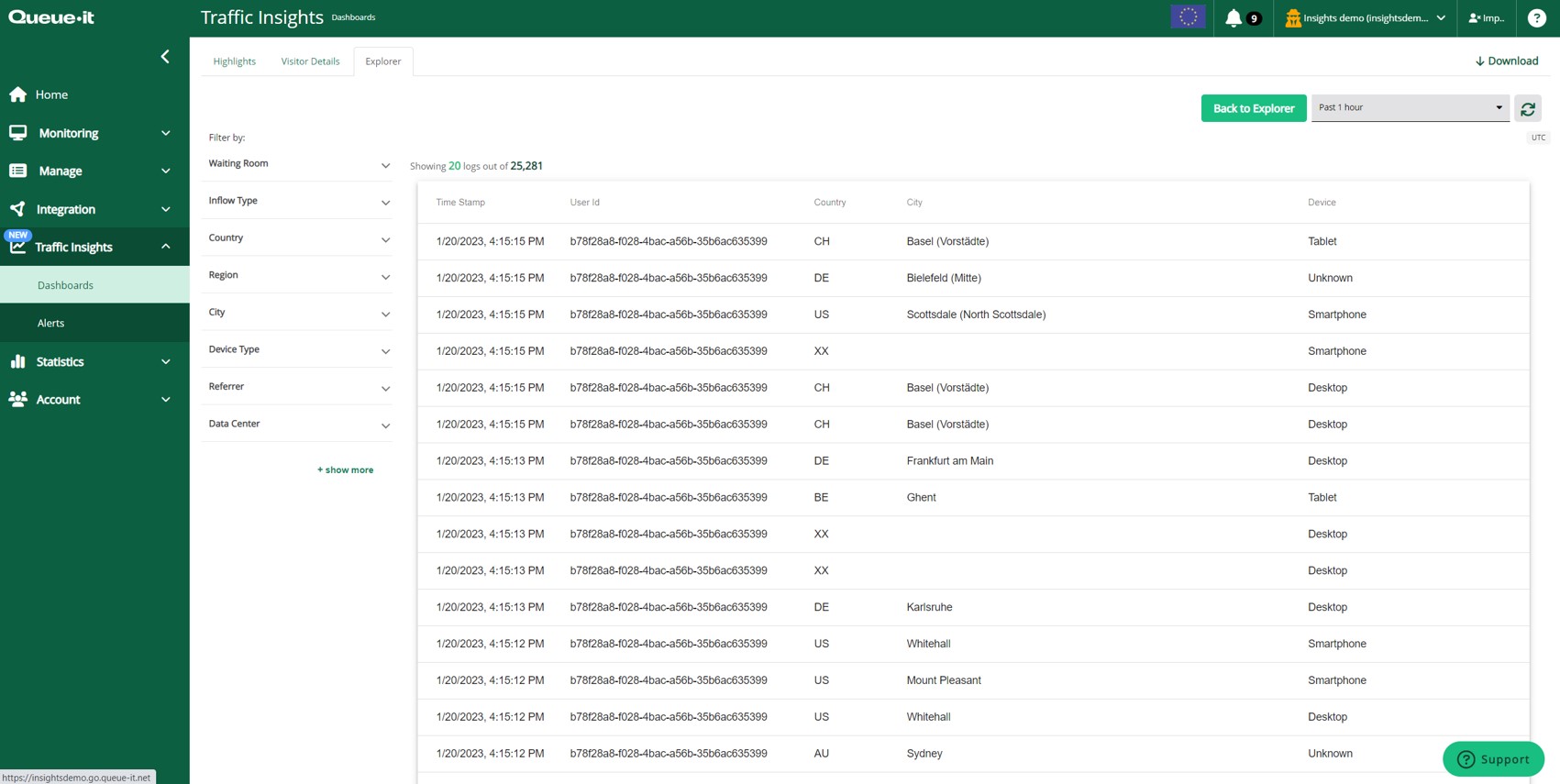
Explorer
The Explorer dashboard gives an overview of all requests made to your selected waiting room(s) (same filters apply as in the Visitor Details dashboard).
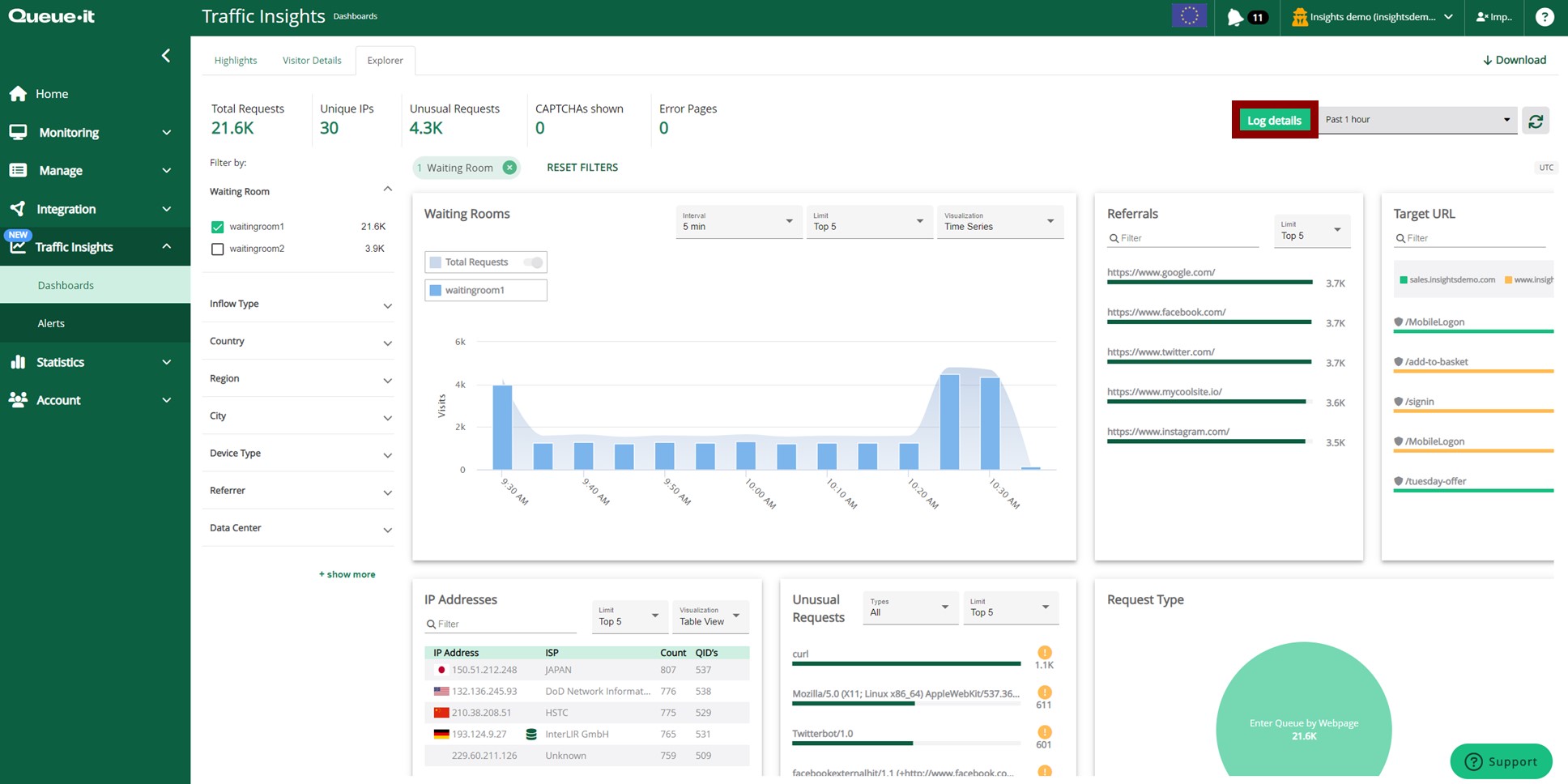
You can also access detailed logs which let you analyze waiting room traffic down to the individualized request level.
Alerts
The Alerts page uses Queue-it’s many years of expertise to flag unusual traffic patterns for all waiting rooms. The page features 3 types of alerts including all relevant data and details:
- Aggressive IP addresses getting QueueIDs
- Data Centers making up a large portion of total requests to the waiting room
- Good bots ending up in the waiting room
From the Alerts page, you can select an alert (on the left side of the page) and get more detailed information (on the right side of the same page).
You can download and share the alert details with other internal stakeholders or Queue-it’s technical support team. You can also click on “Investigate further” button and jump to a pre-filtered view in the Explorer dashboard to further investigate the issue.
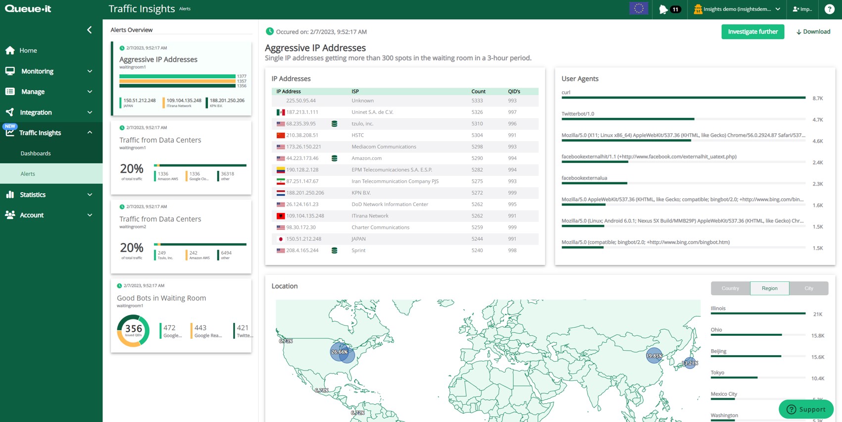
When you view the Waiting Room Monitor page, you will get a pro-active notification of the traffic alert whenever one is created. Clicking on the notification will direct you to the Alerts page.
Bots & Abuse
The Bots & Abuse helps you shine a light on your bot problem. You can:
- Identify the bots and data center traffic trying to enter your waiting room(s)
- Understand how and why traffic is being flagged as bots
- Get valuable data into how many bots you're blocking and which tactics are working
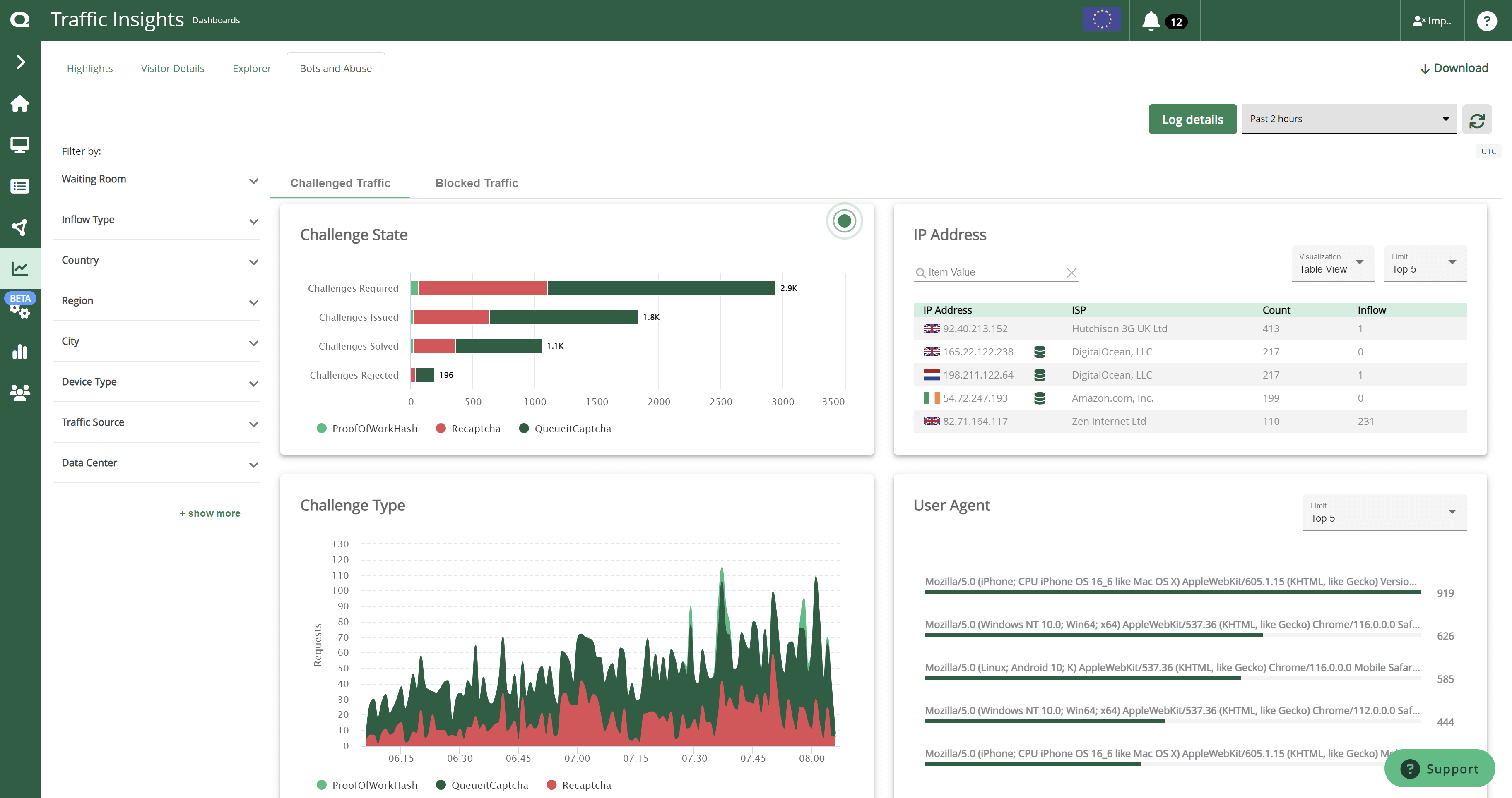
Traffic Insights Bots & Abuse page
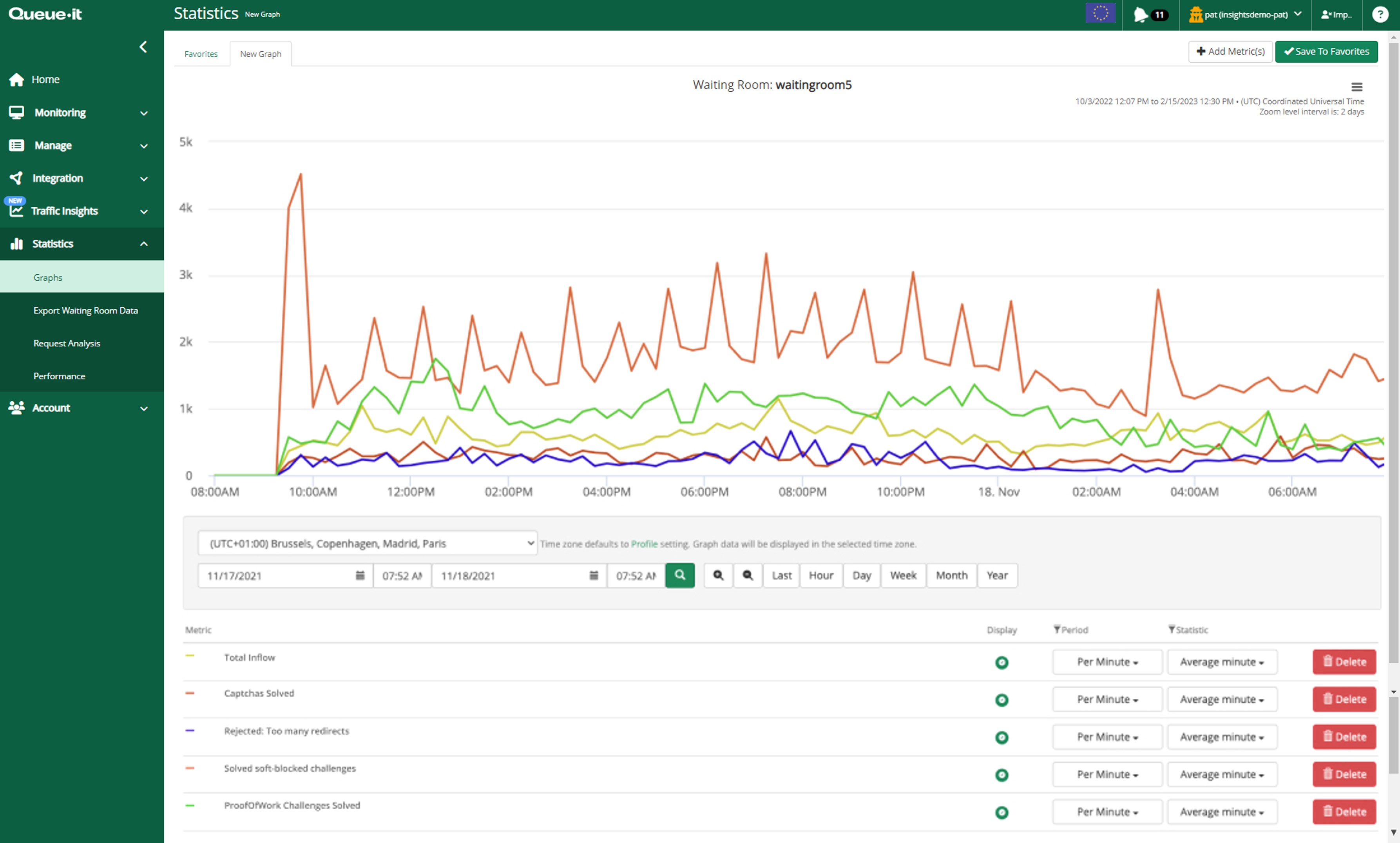
In Graphs, you can look back at historical data to dive deep into specific metrics over a specified timeframe. You can customize graphs based on relevant parameters to give you the historical data you rely on when planning your next sale.
The extensive list of parameters includes everything from queue inflow to requests per minute to bot and abuse parameters like CAPTCHAs solved and Proof-of-Work challenges rejected.
Log in to the GO Queue-it Platform and navigate to Statistics | Graphs.
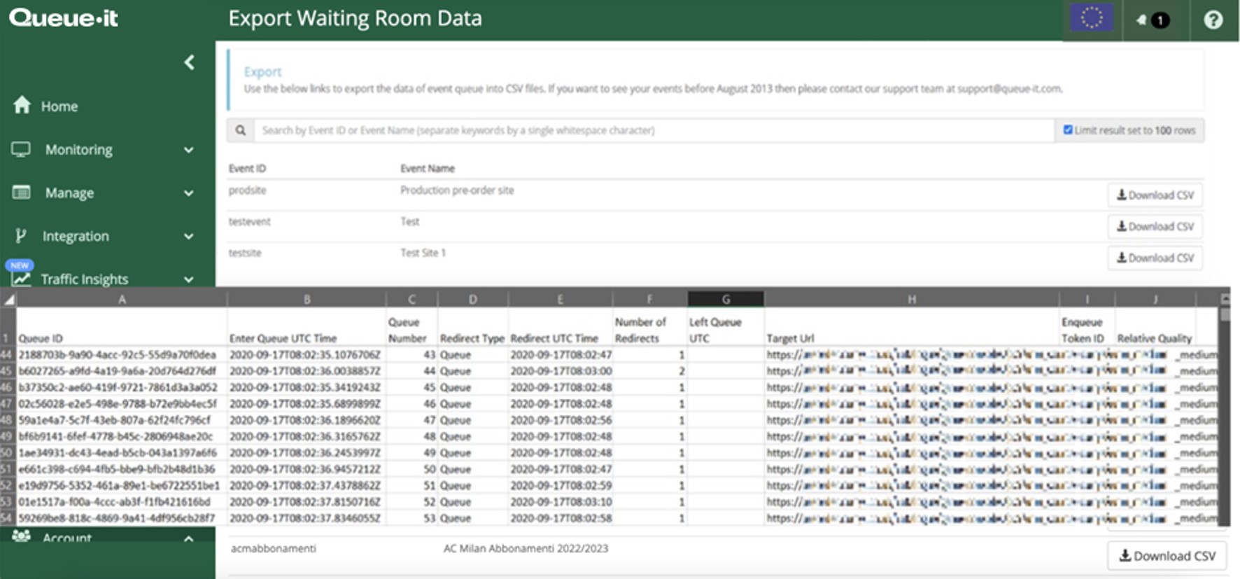
With data export you can export a CSV file with extensive data that you can manipulate in Excel, Tableau, or your reporting tool of choice.
You can find Statistics | Export Waiting Room Data in the GO Queue-it Platform.
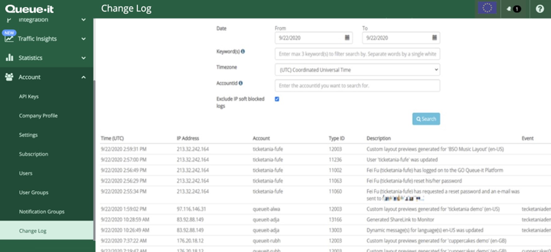
The change log is an admin reporting tool that gives you an audit trail over all changes that take place within the admin system, providing crucial transparency. Examples of what you can see in the audit trail include changes to queue speed, updates to a custom layout, generation of a shareable link, and timestamps of user access.
To stay up to date on the most important updates, you can notify designated user groups by email of any waiting room alerts or account changes.
Below are some examples of technical questions that Queue-it’s reporting and analytics tools can help answer.
If you need to correctly understand your capacity for an upcoming sale or registration, you can use Queue-it’s historical graphs and data exports.
You can use historical graphs to see what inflow was in previous years’ sales, and how that translated into number of visitors in line. Exports can get you similar information in more granular detail.
You can also cross-reference this data with your application performance monitoring data to see how traffic levels impacted your web application’s performance.
The video below shows how you can use the Graphs tool to prepare for future sales or registrations. Graphs are highly customizable, which you can see by selecting the data set, data metric, and how the data is visualized. In this case, the administrator compares how traffic inflow translates into visitors in queue.
If you’d like to understand where your traffic is coming from and what is causing abnormal traffic patterns, you can use Queue-it’s Traffic Insights.
High-visibility sales and registrations, like product drops or government relief applications, are naturally more susceptible to unusual traffic patterns.
So, when the stats deviate from the norm, Traffic Insight’s Alerts page can notify you and explain where the unusual traffic is coming from.
You will get informed if the spike was driven by desirable visitors, like genuine customers, or undesirable visitors, like bots and data center traffic.
To learn more about this tool, read the Traffic Insights blog.
If you’d like to integrate waiting room insights into your internal reporting dashboards, you can use Queue-it’s data exports and Queue-it’s API.
With exports, you can take a CSV file and upload it into your data tool of choice.
You can also leverage one of our APIs to create a digital feed of queue statistics into your tool.
The below demo shows the steps to generate images of Graphs for export, CSV exports, and API setup.
For more information on the API, visit the Queue-it API page.
If you’d like to share high-level or time series metrics with key stakeholders in a simple, visually appealing way, you can use Queue-it’s secure sharing feature.
Secure sharing lets you share the Waiting Room Monitor with key stakeholders, without the hassle of creating a user account in GO, or counting towards your max number of admin accounts
Sharing is secure because you can always revoke the link, and see an overview of all functioning links, which we’ll see in the demo.
To learn more about Queue-it's secure sharing feature, read our product update.