How to improve citizen experience with UX-driven digital transformation

Governments around the world are investing big in digital transformation. But news headlines and Twitter feeds remain filled with stories of digital public services failing and falling flat. Why? A lack of focus on the digital citizen experience. Taking insights from UX research, this article explores how the public sector can put citizens at the center of digital transformation and design for trust.
When the Founding Fathers set out to design America’s capital city, they chose the classical style to reflect the ideals of republican Ancient Rome and democratic Athens. It was these buildings to which citizens would look for help, so they were designed to inspire trust and celebrate the public service.
Can the same be said today of government websites?
For citizens across the world, websites are now the face of the public sector. We file our taxes online, we apply for unemployment, book vaccines, register our change of address, and renew our passports and ID cards.
But with the private sector constantly improving and innovating, citizens have come to expect a lot from digital services. And public sector websites often fall short of these expectations. What makes this more troubling is the fact that the design of government websites impacts how credible citizens see them as.
Government digital transformation is not just about saving money and time—it’s an opportunity to improve the citizen experience and build trust in the public sector. Discover 4 user experience (UX) design insights you can apply to deliver a better citizen experience.
Table of contents
- Why does the public sector lag behind the private sector?
- The hierarchy of user needs
- How to improve citizen experience
Discover the 6 strategies egovernment leaders use to deliver a better citizen experience

A simple Google search of ”government websites are” gives us just a clue what people think of public sector websites.
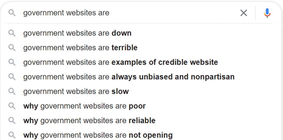
”Down”, ”terrible”, ”slow”, ”poor”, and ”not opening” are words no one wants associated with their web services.
These Google suggestions reflect a report which found that U.S. government websites scored below average (in the 45th percentile) for user experience.
So, how did we get here?
Tom Cochran, former director of new media technologies for the Obama administration, explains that a big part of poor government web design is reactive.
In the private sector, when a customer has a bad user experience, they lose brand trust and are driven to competitors. Private businesses are motivated to design for the user because failure to do so impacts their bottom line.
In the public sector, users aren’t customers, they’re citizens, and when they have a bad experience, they have nowhere else to go.
But this doesn’t mean bad digital public services are harmless. Far from it.
Instead, a poor citizen experience causes frustration among citizens, impacts trust and credibility, and builds a negative perception of government.
Failed digital government projects fill up Twitter feeds and news headlines, and they contribute to the general sense that public services are difficult and behind the times.
Worse still, poorly designed digital systems make public services unfair. This became prominent during the rollout of COVID-19 vaccination registrations online.
Complicated vaccine booking systems gave advantages to those with the digital skills or free time to monitor websites for vaccination slots. This disadvantaged those most vulnerable to COVID-19: the elderly and essential workers.
As civic tech activist Cyd Harrell says, "The idea that government is inefficient and unpleasant to deal with is almost axiomatic at this point, but it doesn’t have to be that way."
RELATED: How Denmark Became a Global Leader in Public Sector Digitalization
To improve the citizen experience, governments need to look to user (citizen) experience design. Booking a vaccine, renewing a passport, filing taxes, and searching for information online are all citizen experiences. And UX design looks to improve these by fulfilling user needs and facilitating smooth and enjoyable digital experiences.
In UX design, there are a few basic needs the user has. Aaron Walter’s Hierarchy of User Needs sets out that systems should be functional, reliable, usable, and pleasurable—in that order.
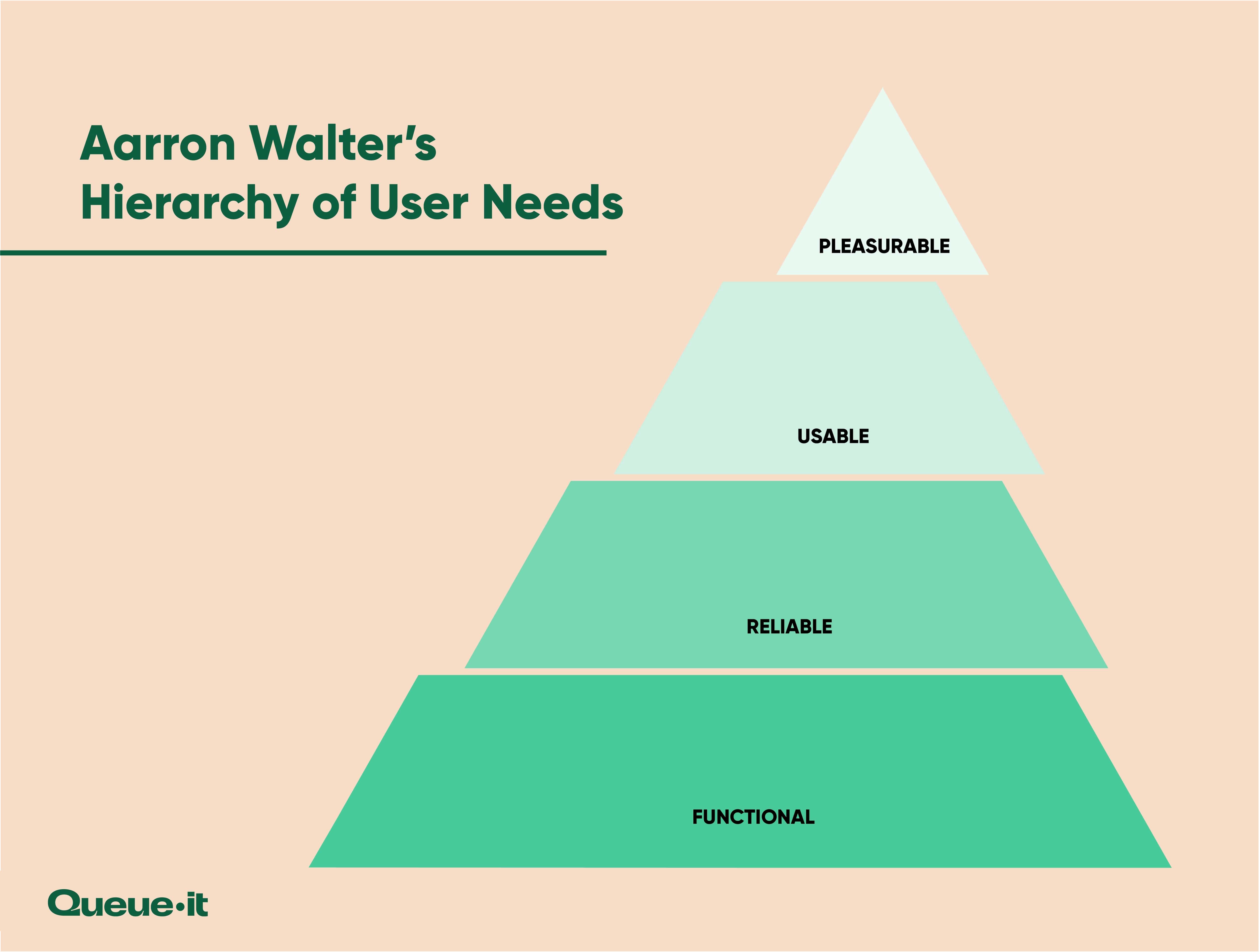
While all digital services should strive for the ”pleasurable” apex of the hierarchy, many public sector services face digital transformation challenges, failing to offer the foundational elements of functionality, reliability, and usability.
In recent years, websites and servers from Europe to the Americas to India crashed as users flooded them to get vaccination bookings. Both the first and second round of U.S. stimulus checks crashed the IRS website. And Michigan’s unemployment site crashed not once, but twice.
So how can digital public services use the hierarchy of user needs to design for trust and create a positive citizen experience?
RELATED: Digital Public Services: 4 Proven Steps to Citizen-Centric Service Delivery
A functional service is one that works to help citizens meet their goal and needs. Functionality is the foundational element of citizen experience design because services are useless if they don’t function.
Take the example of a taxation website: citizens visit the site to file their taxes, to find information about claims or purchases, to find the contact details of tax authorities, to book appointments, and more. If these fundamental aspects of the service aren’t there, or don’t work, the website isn’t functional. It doesn’t serve its core purpose.
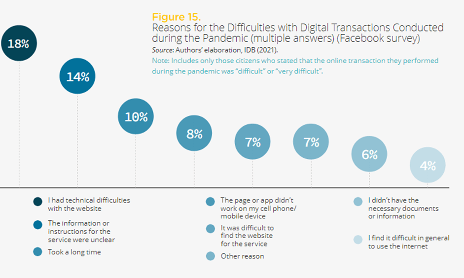
In one survey of over 20,000 Latin American and Caribbean citizens, 39% described completing a government transaction online as ”difficult” or ”very difficult”.
Their top complaints?
Technical difficulties, unclear information, slow processing speeds, and pages being unavailable on mobile.
In short, the websites didn’t function as they should have.
When you’re designing digital technology in the public sector, its function should always be top of mind. Probe the purpose of every website or page, asking:
- Why do users visit it?
- What are their needs once there?
- What do they hope to find or achieve?
- Can they complete their goals?
To answer these questions, you need to listen to citizens. You need to test and retest your website, track how people are using it, and constantly monitor it for issues.
Once your project functions at a base level, it needs to be reliable. Yes, it works in the testing stage, but can citizens really count on the service to fulfill its purpose consistently and reliably?
One of the most famous government website failures was the launch of Obama’s healthcare.gov. With almost $100 million behind the project, the website launched in 2013 and quickly crashed because of high demand. Shortly after it went back online, users had issues with the website being incomplete and insurance companies were forwarded incorrect user data.
250,000 citizens visited the site on the day it launched, and by the end of the day only six had completed and submitted their applications.
What was supposed to be a step forward became a massive liability, and the budget of the scheme ballooned to $1.7 billion.
Incidents like these are a lose-lose situation.
Citizens can’t access their services and are frustrated with governments. And governments make high-profile mistakes, spend massive additional resources, and are plastered across the news.
Citizens turn to governments for essential services—they need to be able to trust these services to be available and reliable.
One of the biggest digital transformation challenges is creating a website and service that can scale. The Digital Analytics Program (DAP) reports that when the first and second round of stimulus checks were released, traffic to the IRS website skyrocketed. It was these massive inflows of citizens which caused the website to crash.
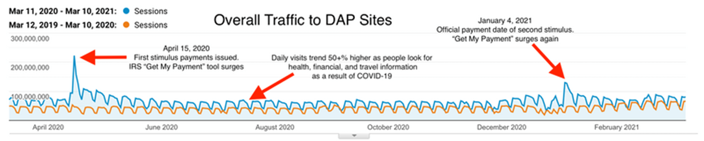
What makes things more difficult for government IT professionals is that traffic spikes are often caused by events and announcements out of their control. It’s impractical, labor-intensive, and expensive to have a website that can handle over 200 million daily users when the average daily traffic is less than half that. But legislative changes, world events, and big announcements can unexpectedly drive citizens to public sector websites, causing them to crash when they’re at their most visible.
RELATED: Prevent Government Website Crashes By Controlling Traffic
Those hosting public sector websites need to understand their website capacity and bottlenecks by load testing their site before it goes live or major announcements are made. Doing this ahead of time, and implementing a traffic management system, can prevent frustrated citizens, wasted resources, and public outrage.
Queue-it has spent ten years in the business of creating online reliability. We work behind-the-scenes to keep the lights on for some of the world’s biggest companies. And throughout the pandemic, we worked with the public sector to help them keep pace with the fast shift to digital.
We worked with the Tokyo Metropolitan Government to run vaccination registrations in the world’s largest city, ensuring the website stayed operational in the face of hundreds of thousands of users.
Now it's unthinkable to launch a booking site without Queue-it.
Masanobu Tenjin, Director for Digital Shift Promotion, Tokyo Metropolitan Government's Bureau of Digital Service
Discover 6 research-backed steps to citizen-centric service delivery.
In UX, usability refers to the ease with which a user interacts with a service. Your website may be functional and reliable, but do citizens find it easy to navigate? Does it guide the citizen to their goals in a clear and intuitive way? Does it cater to diverse groups of citizens?
Think of usability in terms of a new piece of legislation. The legislation is passed, but it’s written by lawyers and policy makers, and for many members of the public, it simply makes no sense.
This is why the U.S. Government passed the Plain Writing Act of 2010, a law which required federal agencies to use clear communication that the public can understand and use.
The same issue applies to government websites, both in use of language and in design.
Sure, the website works for the people who created it, but what about the average person? Can they find what they’re looking for? Do they understand the steps needed to complete their goal?
Digital public services, arguably more so than private sector services, need to be usable and accessible by all. This not only because high usability is associated with higher perceived credibility of government websites, but also because government websites need to cater to all citizens.
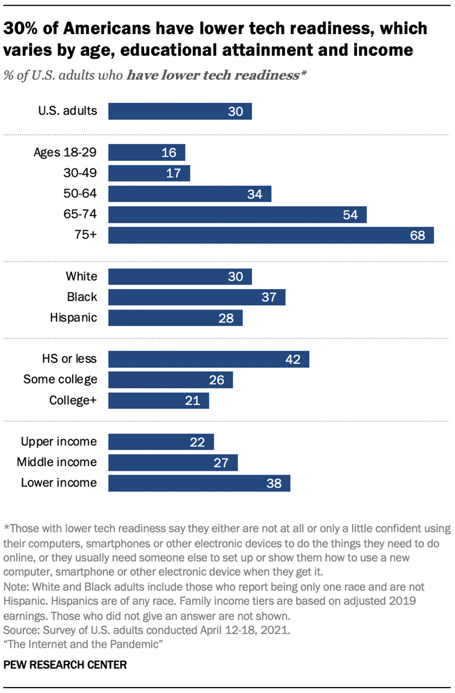
Pew Research center found that 30% of American adults have low tech readiness, with significant disparities related to age, race, education level, and income.
The public sector exists for all citizens. So it’s crucial government digital transformation doesn’t leave behind groups without tech skills.
Improving usability is no easy feat. It takes user interface (UI) and UX designers, repeated tests with people of all backgrounds, and continued monitoring for issues after launch. But it’s an essential step in improving the citizen experience and boosting the credibility of digital public services.
Best practices for improving usability:
- Seek universal usability by recognizing the diverse needs of citizens
- Ensure the service is fair for all citizens
- Strive for consistency to make processes more intuitive
- Design to make errors difficult or impossible
- Allow easy reversal of actions
- Reduce short-term memory load
Designing with the citizen at the forefront not only improves accessibility for more diverse populations but also improves the citizen experience of all those using your service.
Free Download:
6 Proven Strategies to Improve Digital Public Services
When a service is functional, reliable, and usable, it is essentially ready for launch. However, one of the key distinctions between public and private websites is the apex of the user needs hierarchy: pleasurable.
In the private sector, businesses need to make their services a pleasure to use. They want users to breeze through the process, feel good about their purchase, and come back for more.
You may not be trying to make sales, but you still want citizens to be happy.
You want service centers to be clean and professional looking, and public servants to be polite and understanding when interacting with citizens. Why should your website be any different?
What exactly makes digital citizen experience pleasurable will vary, but let’s look at a case study that won the 2021 annual Government Experience Awards, Michigan State.
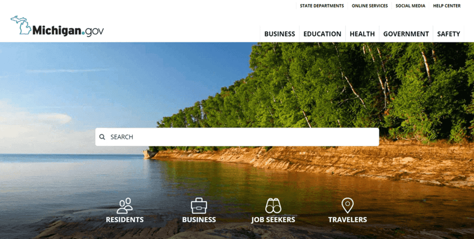
With clean visuals and navigation, a simple user flow, an intuitive search feature, and a focus on accessibility for all, Michigan.gov isn’t your typical public sector website.
“The focus for us has been on improving the digital experience through what we are calling our ‘unified branding’ or ‘overall digital experience’ for the state,” said eMichigan Director Suzanne Pauley. “It should feel very seamless to people as they traverse our digital environment … We have put a huge focus on making sure that our services can be used by everyone.“
The most successful companies in the world invest big in user experience research and design because they know their customers are at the heart of everything they do. Websites like Michigan.gov and programs like the U.K.'s Government Digital Service are taking notice, and are working to put citizens at the heart of their digital public services.
How a virtual waiting room can help
Virtual waiting rooms are a service that, first and foremost, fulfill the functional and reliable tiers of the user needs hierarchy. In short, they keep websites online, no matter the demand.
But the virtual waiting room solution does more than just that. It enables a better experience by:
- Tapping into queue psychology by providing users with ample information about their wait time.
- Creating universal usability and preventing errors by maintaining a user’s place in the queue whether they navigate away from the page or refresh it.
- Reducing short-term memory load with a progress bar and queue number, so users don’t have to worry about how long their wait is.
- Delivering online fairness by ensuring that visitors are served in a first-in, first-out order.
RELATED: The Comprehensive Guide to Virtual Waiting Rooms: All Your Questions Answered
Prioritize your digital citizen experience
There’s no doubt about it: the future of the public sector is digital. And for many citizens, websites have already become the face of government.
Designing these websites with citizens’ needs at the center represents a key opportunity to improve the digital citizen experience.
A functional website lets citizens fulfill their goals online.
A reliable website is one citizens can count on and access when they need it most.
A usable website makes digital public services easier for all citizens to access and use.
A delightful website is a joy to use and keeps citizens coming back for more.
And a website that fulfills all these needs is one that is more trustworthy, fair, and reliable. It’s what all public sector digital services should strive for.
(This blog has been updated since it was written in 2021.)